oks-ui
Combo Chart component
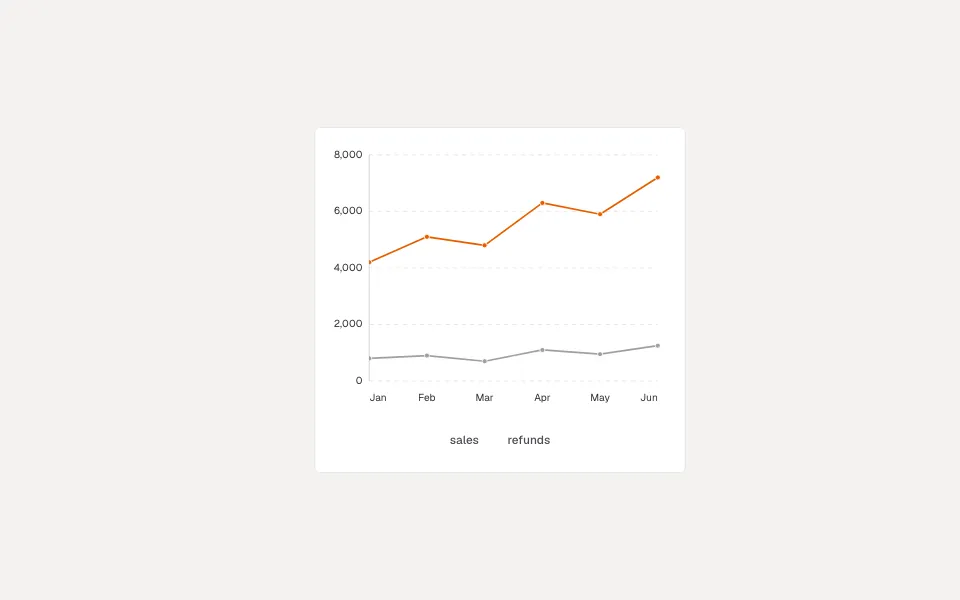
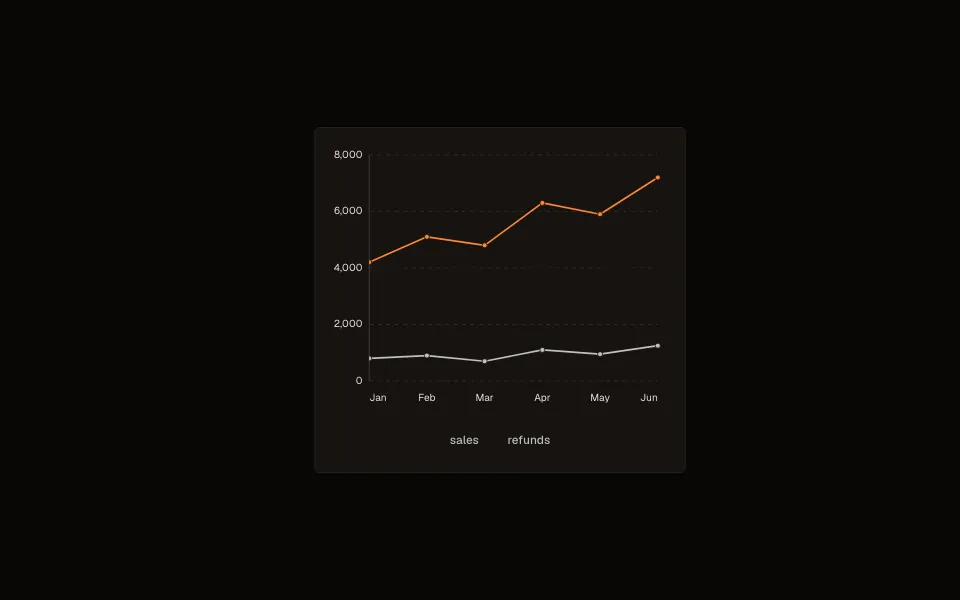
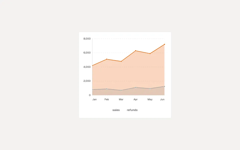
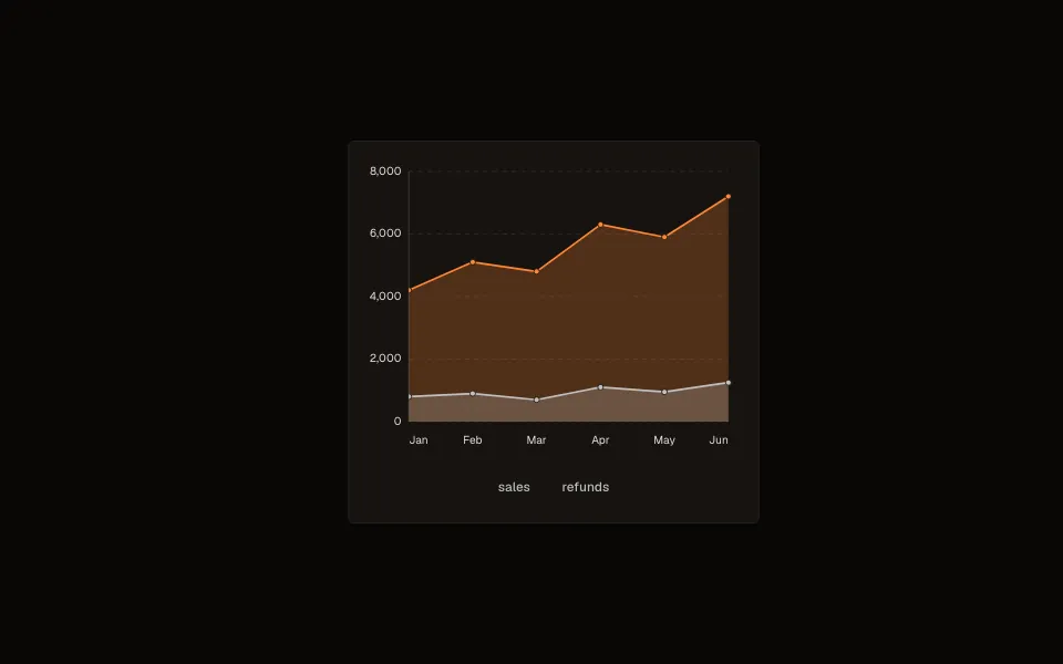
Chart covers nine chart types (line, area, bar, column, pie, donut, heatmap, sparkline, combo) behind one component and a row-based data API — hand it an array of plain objects plus which fields are the category and the series, and it figures out the rest. Every data point is keyboard-reachable and announces its value, not just hover-only like most charting libraries.
Playground
Change a prop on the right and the preview updates. Switch to Code to copy what you see.
Row-based data
The common path: pass data as a plain array of objects, x as the field holding the category (a date, a label), and series for the field(s) to plot. No need to pre-shape data into a categories/series structure — Chart derives it from your rows.
<Chart
  type="line"
  title="Monthly signups"
  data={[
    { month: "Jan", signups: 42 },
    { month: "Feb", signups: 58 },
    { month: "Mar", signups: 51 },
    { month: "Apr", signups: 67 },
  ]}
  x="month"
  series="signups"
/>
Multiple series
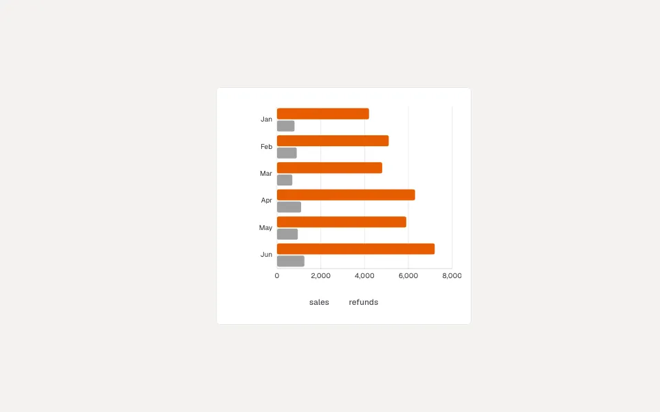
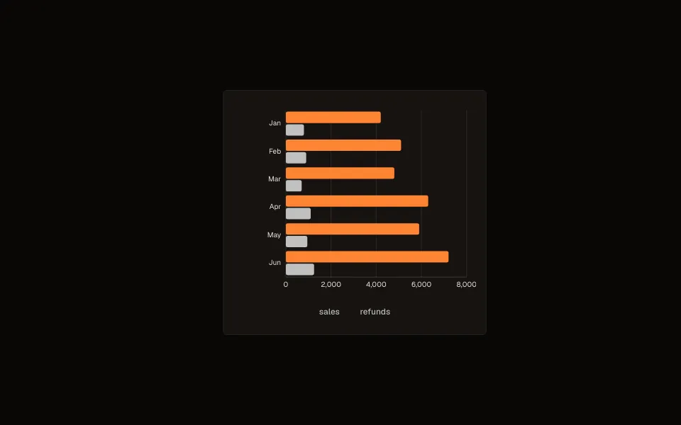
series accepts an array for a multi-line/multi-bar chart — pass an array of accessors (or ChartSeriesDef objects with their own label/color) and Chart plots each one, auto-enabling the legend once there's more than one.
<Chart
  type="bar"
  data={salesData}
  x="quarter"
  series={[
    { key: "revenue", label: "Revenue" },
    { key: "cost", label: "Cost" },
  ]}
/>
Projected/forecast segments
A series entry can mark itself isProjection to render as a distinct dashed segment — for a forecasted continuation of real data (actuals through today, a projected trend afterward) without needing two separate charts stitched together. Bar and column charts split the same way, rendering projected bars with their own visual treatment on the same axis scale as the real values.
<Chart
  type="line"
  data={[...actuals, ...forecast]}
  x="month"
  series={[
    { key: "revenue", label: "Actual" },
    { key: "projectedRevenue", label: "Forecast", isProjection: true },
  ]}
/>
Axis, legend, and tooltip options
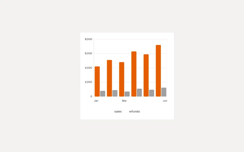
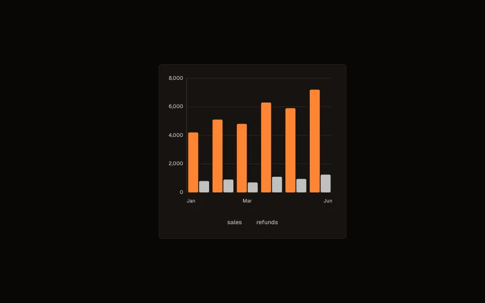
axis/axisX/axisY control tick visibility and formatting independently per axis; legend and tooltip each accept either a boolean to toggle them outright or an options object for finer control (position, formatting). dataFormat applies a shared prefix/suffix/decimal-place format across labels and tooltips at once, for currency or percentage values.
<Chart
  type="column"
  data={data}
  x="month"
  series="revenue"
  dataFormat={{ prefix: "$", decimals: 0 }}
  legend={{ position: "bottom" }}
/>
Zoom, export, and fullscreen
Three opt-in interaction features, each disabled by default: zoom enables axis zoom/pan (mode: "x" for horizontal-only, "xy" for both, plus wheel/pan toggles); export adds an action that downloads the chart as SVG or PNG; fullscreen adds a toggle that expands the chart to fill the viewport. All three default to false/off, since not every chart context wants the extra chrome.
<Chart
  type="line"
  data={data}
  x="date"
  series="value"
  zoom={{ mode: "x" }}
  export={{ formats: ["png", "svg"] }}
  fullscreen={{ enabled: true }}
/>
Sparklines and combination charts
type="sparkline" is a small trend for a table cell or a stat card: no axes, grid, legend, title or frame, 40 px high, with a dot on the last point. sparkline={{ kind }} makes it a line, an area or columns. type="combo" draws columns, lines and areas together: each series says type ("column", "line" or "area") and axis ("left" or "right"), and a series on the right gets its own scale through axisY2, so a rate can sit over amounts.
<Chart type="sparkline" data={week} x="day" series="sales" ariaLabel="Sales this week" />

<Chart
  type="combo"
  data={rows}
  x="month"
  series={[
    { key: "revenue", name: "Revenue" },
    { key: "rate", name: "Conversion (%)", type: "line", axis: "right" },
  ]}
  axisY={{ title: "Revenue" }}
  axisY2={{ title: "Conversion (%)" }}
/>
Targets, dates and stacked areas
referenceLines draws a labelled line at a value (a goal, a limit, an average) across a line, area, column or bar chart, and the scale grows to include it. When every x value is a Date, a line or area chart places each point where its date falls, so a month-long gap looks like one (axisX.scale: "category" spaces points evenly instead). A stacked area (line.area.stacked) stacks the series so the top edge is the total, and tooltip.showTotal adds it up. axisX and axisY accept a title.
<Chart
  type="area"
  data={data}
  x="date"
  series={["web", "mobile"]}
  line={{ area: { stacked: true } }}
  referenceLines={[{ value: 5000, label: "Target", dashed: true }]}
  axisY={{ title: "Sessions" }}
/>
Screen readers, translation and large data
Every chart carries a visually hidden table of its values (turn it off with dataTable={false}), keyboard arrows move between points, and touch and mouse use the same tooltip. labels translates or rewords the texts the chart adds (export, fullscreen, reset zoom, loading, no data). Series beyond the seven base colours reuse the hues in lighter and darker shades, so two lines are never the same colour, and exports keep the real colours and background. Pointing at 16,000 points stays fast because lines and labels are not redrawn on each move.
Loading, error, and empty states
isLoading, error, and empty each swap in a dedicated state in place of the plotted chart — pass them straight from whatever data-fetching hook is feeding the chart's data, instead of conditionally rendering Chart itself and losing its layout/sizing while the state changes.
<Chart type="line" data={data ?? []} x="month" series="value" isLoading={isLoading} error={fetchError && "Couldn't load data."} />Props
The full public API for Combo Chart. Every prop is stable and intentionally typed.
Content
| Prop | Type | Default | Description |
|---|---|---|---|
| data | Row[] | { categories, series } | — | Row-based data array, or explicit categories/series (required). |
| x | keyof Row | ((row: Row) => ChartCategory) | — | Category accessor, row-mode only. |
| series | ChartSeriesDef<Row> | ChartSeriesDef<Row>[] | — | Series accessor(s), row-mode only. |
| title / description | ReactNode | — | Chart heading text. |
| ariaLabel | string | — | Accessible label for the chart. |
| dataFormat | ChartDataFormatOptions | — | Value formatting (prefix/suffix/decimals) for labels/tooltips. |
| showLabels | ChartShowLabelsOptions | — | Inline value-label visibility. |
| labels | Partial<ChartLabels> | English | Translate or reword every text the chart adds: export, fullscreen, resetZoom, loading, noData, keyboardHint, filterAll, total and the data table headings. |
data
Row[] | { categories, series }
default: —
Row-based data array, or explicit categories/series (required).
x
keyof Row | ((row: Row) => ChartCategory)
default: —
Category accessor, row-mode only.
series
ChartSeriesDef<Row> | ChartSeriesDef<Row>[]
default: —
Series accessor(s), row-mode only.
title / description
ReactNode
default: —
Chart heading text.
ariaLabel
string
default: —
Accessible label for the chart.
dataFormat
ChartDataFormatOptions
default: —
Value formatting (prefix/suffix/decimals) for labels/tooltips.
showLabels
ChartShowLabelsOptions
default: —
Inline value-label visibility.
labels
Partial<ChartLabels>
default: English
Translate or reword every text the chart adds: export, fullscreen, resetZoom, loading, noData, keyboardHint, filterAll, total and the data table headings.
Appearance
| Prop | Type | Default | Description |
|---|---|---|---|
| type | "line" | "area" | "bar" | "column" | "pie" | "donut" | "heatmap" | "sparkline" | "combo" | — | Chart type (required). |
| background | string | — | Chart background color. |
| unstyled | boolean | false | Drop the built-in <figure> card frame (border / padding / radius / surface) — for a chart nested in a Card or a sparkline slot. |
| palette | { colors?; colorShade?; roles? } | — | Series color palette overrides. |
| line / bar / column / pieStyle / pie / heatmap | type-specific options | — | Per-type rendering options. pie: { center?: false, renderCenter?: ({total, formatted}) => ReactNode } for the donut hole. heatmap: { color, minOpacity, maxOpacity, domain, cellGap, cellRadius, showValues, emptyColor }. |
| sparkline | { kind?: "line" | "area" | "column" } | { kind: "line" } | type="sparkline" only: the shape of the small trend. |
type
"line" | "area" | "bar" | "column" | "pie" | "donut" | "heatmap" | "sparkline" | "combo"
default: —
Chart type (required).
background
string
default: —
Chart background color.
unstyled
boolean
default: false
Drop the built-in <figure> card frame (border / padding / radius / surface) — for a chart nested in a Card or a sparkline slot.
palette
{ colors?; colorShade?; roles? }
default: —
Series color palette overrides.
line / bar / column / pieStyle / pie / heatmap
type-specific options
default: —
Per-type rendering options. pie: { center?: false, renderCenter?: ({total, formatted}) => ReactNode } for the donut hole. heatmap: { color, minOpacity, maxOpacity, domain, cellGap, cellRadius, showValues, emptyColor }.
sparkline
{ kind?: "line" | "area" | "column" }
default: { kind: "line" }
type="sparkline" only: the shape of the small trend.
Layout & positioning
| Prop | Type | Default | Description |
|---|---|---|---|
| axisY2 | ChartAxisOptions | — | type="combo": the right-hand value axis (show, tickCount, title) for series with axis: "right". |
| height | number | 320 | Chart height in pixels. |
| padding | { top?; right?; bottom?; left?: number } | — | Plot area padding. |
| axis / axisX / axisY | ChartAxisOptions | — | Axis visibility, ticks, title (drawn under the axis) and, on axisX, scale (auto, category or time). axisX/axisY take { show?, hide?, tickCount? } — `{ hide: true }` is an alias for `{ show: false }` (an explicit `show` wins). A custom `padding` on a labelled bar/column axis is floored so labels don't vanish. |
| grid | ChartGridOptions | — | Gridline configuration. |
axisY2
ChartAxisOptions
default: —
type="combo": the right-hand value axis (show, tickCount, title) for series with axis: "right".
height
number
default: 320
Chart height in pixels.
padding
{ top?; right?; bottom?; left?: number }
default: —
Plot area padding.
axis / axisX / axisY
ChartAxisOptions
default: —
Axis visibility, ticks, title (drawn under the axis) and, on axisX, scale (auto, category or time). axisX/axisY take { show?, hide?, tickCount? } — `{ hide: true }` is an alias for `{ show: false }` (an explicit `show` wins). A custom `padding` on a labelled bar/column axis is floored so labels don't vanish.
grid
ChartGridOptions
default: —
Gridline configuration.
Behavior & states
| Prop | Type | Default | Description |
|---|---|---|---|
| referenceLines | { value, label?, color?, dashed? }[] | — | Lines across a line, area, column or bar chart at fixed values (a target, a limit). The scale makes room for them. |
| dataTable | boolean | true | Adds a visually hidden table of the values, so a screen reader can read the numbers. |
| legend | boolean | ChartLegendOptions | true for multi-series | Legend visibility/position. |
| tooltip | boolean | ChartTooltipOptions | true | Hover/focus tooltip visibility and formatting. |
| zoom | false | { mode?: "x" | "xy"; wheel?; pan? } | — | Enables zoom/pan on axis charts. |
| export | false | { formats?: ("svg" | "png")[]; filename? } | — | Enables an export action (SVG/PNG). |
| fullscreen | false | { enabled?: boolean } | — | Enables a fullscreen toggle action. |
| filters | false | ChartFiltersOptions<Row> | — | Enables interactive data filters. |
| isLoading | boolean | — | Shows a loading state instead of the chart. |
| error | ReactNode | — | Shows an error state instead of the chart. |
| empty | ReactNode | — | Shown when data resolves to nothing plottable. |
referenceLines
{ value, label?, color?, dashed? }[]
default: —
Lines across a line, area, column or bar chart at fixed values (a target, a limit). The scale makes room for them.
dataTable
boolean
default: true
Adds a visually hidden table of the values, so a screen reader can read the numbers.
legend
boolean | ChartLegendOptions
default: true for multi-series
Legend visibility/position.
tooltip
boolean | ChartTooltipOptions
default: true
Hover/focus tooltip visibility and formatting.
zoom
false | { mode?: "x" | "xy"; wheel?; pan? }
default: —
Enables zoom/pan on axis charts.
export
false | { formats?: ("svg" | "png")[]; filename? }
default: —
Enables an export action (SVG/PNG).
fullscreen
false | { enabled?: boolean }
default: —
Enables a fullscreen toggle action.
filters
false | ChartFiltersOptions<Row>
default: —
Enables interactive data filters.
isLoading
boolean
default: —
Shows a loading state instead of the chart.
error
ReactNode
default: —
Shows an error state instead of the chart.
empty
ReactNode
default: —
Shown when data resolves to nothing plottable.
Events
| Prop | Type | Default | Description |
|---|---|---|---|
| onPointClick | (event: ChartPointEvent<Row>) => void | — | Called when a data point is clicked or activated via keyboard. |
| onCellClick | (event: ChartHeatmapCellEvent<Row>) => void | — | type="heatmap" — a cell was clicked or keyboard-activated. |
| onLegendChange | (hiddenSeriesIds: string[]) => void | — | Called when series visibility toggles via the legend. |
| onSelectionChange | (selection: ChartSelection) => void | — | Called when a zoom/brush selection changes. |
onPointClick
(event: ChartPointEvent<Row>) => void
default: —
Called when a data point is clicked or activated via keyboard.
onCellClick
(event: ChartHeatmapCellEvent<Row>) => void
default: —
type="heatmap" — a cell was clicked or keyboard-activated.
onLegendChange
(hiddenSeriesIds: string[]) => void
default: —
Called when series visibility toggles via the legend.
onSelectionChange
(selection: ChartSelection) => void
default: —
Called when a zoom/brush selection changes.
Styling
| Prop | Type | Default | Description |
|---|---|---|---|
| className / classNames / style | string / ChartClassNames / CSSProperties | — | Styling overrides (classNames covers base/header/title/description/actions/stage/svg/legend/filters). |
className / classNames / style
string / ChartClassNames / CSSProperties
default: —
Styling overrides (classNames covers base/header/title/description/actions/stage/svg/legend/filters).
Accessibility
- Every data point is keyboard-reachable — Tab/arrow-key navigation moves between points, and onPointClick fires the same way for a keyboard activation (Enter/Space) as it does for a mouse click.
- Pass ariaLabel describing what the chart shows ("Monthly signups by quarter") — a chart with no accessible name is announced generically, which tells a screen reader user nothing about its content.
- title/description render as real visible text (not just a tooltip), doubling as a readable summary for anyone who can't perceive the plotted shape itself.
- The legend, when present, is independently keyboard-operable — toggling a series's visibility via onLegendChange works the same from keyboard as from a mouse click on the legend swatch.
Best practices
- Use dataFormat once for consistent number formatting across labels/tooltips instead of pre-formatting values in your own data — keeping raw numbers in data lets Chart handle formatting, sorting, and axis scale correctly.
- Only enable zoom for charts genuinely long enough to benefit from it — dense time-series data, mostly. Turning it on for a 4-bar comparison chart just adds interaction surface with nothing to zoom into.
- Reach for pie/donut only for a small number of categories (roughly five or fewer) where part-to-whole is the actual point — beyond that, a bar chart reads more accurately and doesn't force awkward slice-color distinctions.
- Use isProjection for genuinely forecasted/estimated data, not just to stylistically differentiate two real series — the dashed treatment specifically communicates "this part isn't actual measured data."
- Always pass title or ariaLabel (ideally both) — an unlabeled chart is one of the least accessible patterns in a data-heavy UI.