oks-ui
Omkar Sahu · 2 min read
Published · by Omkar Sahu
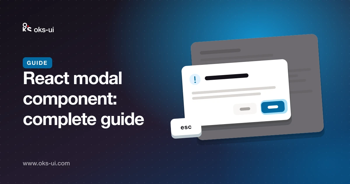
A modal is a box that takes over the screen until the user deals with it. Used well it keeps people in their flow; used badly it traps them. This guide covers everything oks-ui's Modal does and when to reach for something else.
import { Modal } from "oks-ui/modal";
import "oks-ui/modal.css";
import { Button } from "oks-ui/button";
import "oks-ui/button.css";Modal is controlled: you own the open state.
const [open, setOpen] = useState(false);

<Button color="primary" onPress={() => setOpen(true)}>Invite people</Button>

<Modal
  isOpen={open}
  onClose={() => setOpen(false)}
  title="Invite people"
  actions={
    <>
      <Button variant="bordered" onPress={() => setOpen(false)}>Cancel</Button>
      <Button color="primary" onPress={send}>Send invites</Button>
    </>
  }
>
  Anyone you invite can read and comment on your posts.
</Modal>
title renders the heading that names the dialog for screen readers; actions is the row at the bottom. Put the confirming action last, on the right, where people expect it.
size takes xs (320px), sm (420px), md (640px, the default), lg (860px), xl (1100px) and full. You can also pass a number of pixels or any CSS width.
sm. A short question doesn't need a wide box.md.lg and up — but consider a page instead.For a question that interrupts the user and needs an answer, use role="alertdialog" and name the thing in the title:
<Modal
  isOpen={open}
  onClose={close}
  role="alertdialog"
  size="sm"
  title="Delete “Q3 report”?"
  actions={
    <>
      <Button variant="bordered" onPress={close}>Cancel</Button>
      <Button color="danger" onPress={remove}>Delete</Button>
    </>
  }
>
  The file and its history are removed. This can't be undone.
</Modal>
Write what will happen, not "Are you sure?".
Two changes make a form dialog behave:
<Modal
  isOpen={open}
  onClose={close}
  title="New project"
  closeOnOutsideClick={false}
  initialFocusRef={nameRef}
  actions={
    <>
      <Button variant="bordered" onPress={close}>Cancel</Button>
      <Button color="primary" isLoading={saving} onPress={save}>Create</Button>
    </>
  }
>
  <input ref={nameRef} />
</Modal>
closeOnOutsideClick={false} stops a stray click from losing what someone typed, and initialFocusRef puts the cursor in the first field.
closeOnEscape (default on) — leave it on; Escape is what people press.closeOnOutsideClick (default on) — turn off for forms.dismissible={false} hides the close button, for a dialog that must be answered. Use it rarely, and never without a visible action that closes it.backdrop passes options through to the overlay — blur and backgroundOpacity adjust how much of the page shows through. animationDuration and animationType control the entrance; both respect a reader's "reduce motion" setting.
Focus moves into the dialog when it opens and is trapped while it's open, Escape closes it, focus returns to the button that opened it, and the page behind stops scrolling. The dialog carries role="dialog", aria-modal="true" and its title as the accessible name.
Drawer sliding from the bottom feels more natural and leaves more room.Try every prop on the Modal component page.
Omkar Sahu is a front-end engineer based in Hyderabad, India, with more than 17 years of professional experience. He spent 12 years as a senior front-end developer, designing and building websites, and has worked as a full-stack developer since 2022. He created oks-ui, a React component library with no runtime dependencies, and writes and maintains this site.