oks-ui
Omkar Sahu · 5 min read
I build oks-ui, and its themes are CSS variables. The variables were never the hard part. The hard part was the colours they produce once text sits on them, in light and in dark, on every surface. This post is the list of what I got wrong, with the numbers, and the rules I now follow.
How the theme is built
Every colour in oks-ui is a CSS variable. A palette holds the raw shades (--oks-palette-neutral-500 and so on), and roles point at the palette (--oks-color-primary-500, --oks-color-fg-muted). Components read the roles. To change a brand you override the role variables on :root, and to switch themes you set data-theme="dark" on the html element, which swaps every role to its dark value. There is no theme provider and no JavaScript in the path.
The mechanism is simple. The trouble was in what the colours looked like once text was drawn on them, in both themes, on every surface. The rest of this post is the list of what broke.
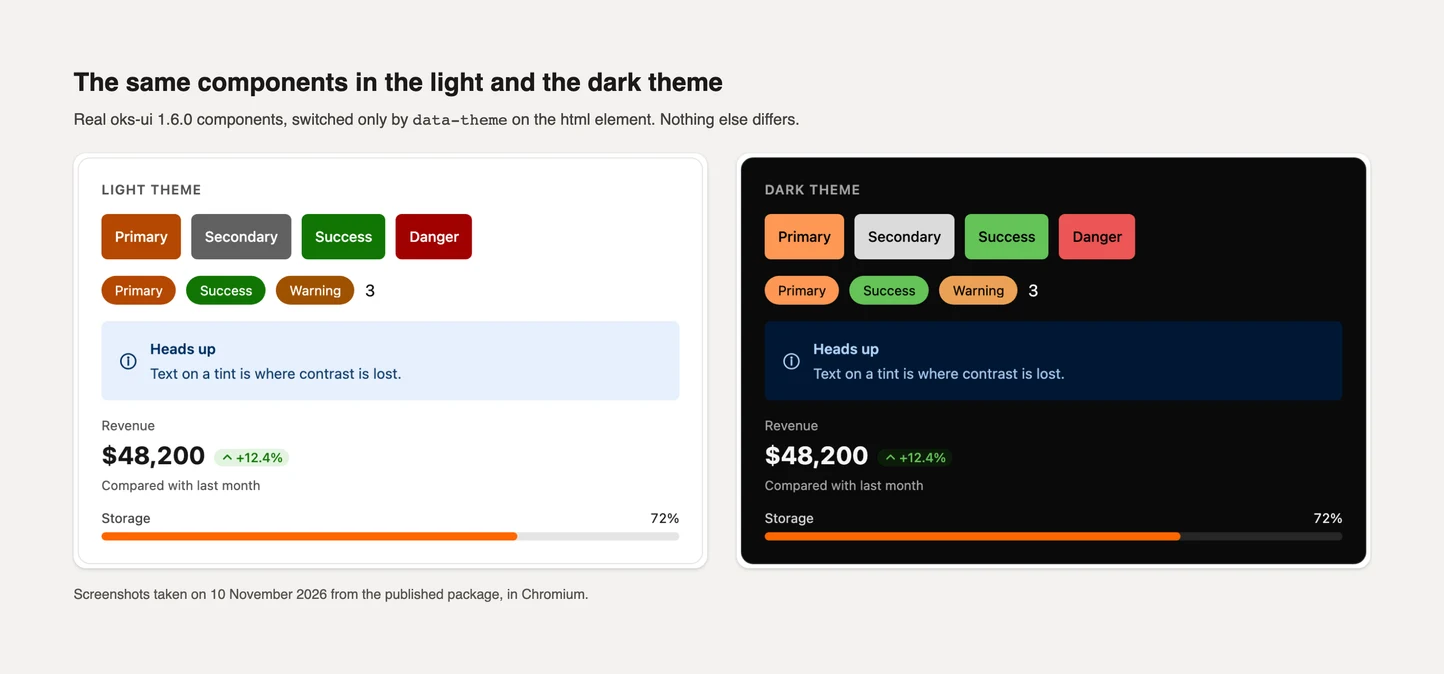
The 500 shade is the same in light and dark
Each colour is a ramp from 50 (palest) to 950 (darkest). In oks-ui the 500 shade is the anchor: the same hex value in the light and the dark theme. That is a sensible idea for a brand colour, and it caused the first contrast failure.
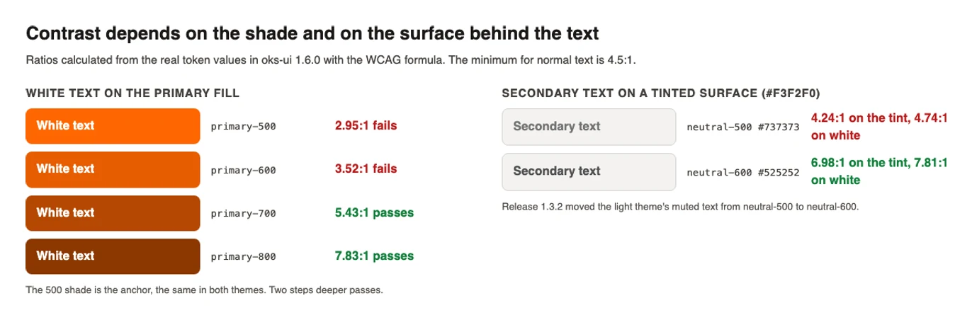
White text on a 500 fill, and 500-coloured text on white, both fail the WCAG AA minimum of 4.5:1 for most colours. The measured ratios in the 1.2.0 release notes are 2.95:1 for the primary colour and 2.17:1 for secondary, which is a pale grey. A button with a white label on that fill is hard to read, and nothing in the code looked wrong, because the token was doing exactly what it said.
The fix in 1.2.0 was to stop using the anchor shade wherever text is involved. Anything that puts text on a colour, or paints text in a colour, reads two steps deeper (three for the pale secondary). Because the ramp is theme-aware, "deeper" means darker in the light theme and lighter in the dark theme. The solid fills of Button, Chip, Badge, Avatar and others became visibly deeper as a result, which is a visual change that was worth announcing, and was.
Advertisement
The label on a fill has to flip with the theme
The old rule for the label on a coloured fill was a single comparison in the code: use black if the shade number is 400 or below, otherwise white. It looks reasonable and it is wrong in the dark theme, where a low shade number is no longer a light colour. In dark mode the rule picked the wrong label colour.
The replacement is two tokens, --oks-palette-neutral-0 and --oks-palette-neutral-950, and the label colour now comes from them and flips with the theme. In dark mode the fill is lighter and its label is dark, and nothing is hard-coded to #fff or #000.
Muted text on a tinted surface
Secondary text, such as captions, table headers, timestamps and placeholders, uses --oks-color-fg-muted. In the light theme it was neutral-500, which is #737373. On white that is 4.7:1, a pass. On a lightly tinted surface such as #f3f2f0 it is 4.2:1, a fail, and tinted surfaces are everywhere in a real application: table headers, cards, selected rows, the wash behind a selected menu item.
Release 1.3.2 moved the token to neutral-600 (#525252, about 7:1) and moved the selected Nav label from primary-700 to primary-800 (4.4:1 to about 6.5:1 on its wash). The dark theme was left as it was.
The general lesson is that a contrast check on white proves little. The text lives on a tint, so the check has to be made on the tint.
Where a brand override stops working
A theme is overridden by the person who uses the library, so the library's own CSS must be easy to beat. Release 1.1.2 fixed a case where it was not. The dark tokens were written as :root[data-theme="dark"], a selector that outranks a plain :root. A brand override on a bare :root won in the light theme and lost in the dark one, so rebranded Progress, Chip, Chart and Badge colours quietly went back to the defaults in dark mode only.
Nobody notices that bug by reading code. It shows up when someone toggles the theme and the brand colour disappears. The fix wraps both the base and the dark blocks in :where(), which gives them zero specificity, so an override on a bare :root now wins in both themes, which is the behaviour anyone would expect.
What building real apps showed
Six hosted templates were built on oks-ui in late summer 2026, and they exercised the themes harder than any test. Two things stand out in their histories.
When release 1.2.0 made the ramps theme-aware, a template whose dark theme did not mirror its own ramps began to show black labels on dark fills: its light shades were in the wrong places. The fix in each was to mirror the ramp in dark (50 becomes 950, and so on) and keep muted text above 4.5:1. One template, Verox, needed a dark-mode fix on 19 September because its own colour variables collided with names oks-ui already defines. Choose names for your own tokens that cannot be mistaken for the library's.
On 4 October the same kind of commit went into all six templates: text contrast, landmarks and heading order. They were the same three classes of defect each time, which is a useful sign that they come from habits and not from one bad template.
The latest round, and what is not released
An audit of the library in early November found more of the same kind, and they were fixed on the main branch but are not yet in a published version (as of 9 November 2026):
- The up and down change pills in Stat used the 600 shade of success and danger for text on a pale tint. They now use 700.
- A tint can need a deeper shade than expected. In the TextEditor, accent-coloured text on a 16% tint measured 4.37:1 with the 700 shade, which is just under the limit, so it uses 800 through a dedicated variable,
--block-editor-accent-text. - The text in the middle of a donut chart was black in dark mode. It now takes
currentColor. - A refusal message in FileField did not meet contrast in dark mode. It now uses the
--oks-color-danger-fgtoken, which exists for error text.
These were checked with axe-core in a real browser, in the light and the dark theme, and the result after the fixes was zero contrast violations.
Rules that came out of it
- Never put text on the anchor shade. Use the shade two steps away, and let the ramp decide which direction that is in each theme.
- Pick the label colour from a token that flips with the theme, not from a hard-coded white or black.
- Check contrast on the surface the text will actually be on, including tints, not on white.
- Test both themes, and test an override in both. The specificity bug above existed in only one theme, and nobody sees that by testing only light.
- Give your own variables names the library does not use.
- Make overrides easy: zero specificity for the defaults, so a plain
:rootalways wins.
Try it on your own app
To see where your own theme is weak, switch it to dark, run axe-core on the page, and then override one variable and run it again. The two documentation pages on theming and dark mode show the variables, and the post on dark mode with no flash covers how to set the theme before the first paint.
Limits
The ratios here were measured on the specific colours and surfaces named. A different brand colour has different numbers, so use the method and not the figures. The 700 and 800 choices above are for the default palette's tints; a very pale or very saturated tint may need another step. And a contrast checker tells you the ratio, not whether the text is pleasant to read. Look at the page too.
If you find a place where your own theme breaks that this post does not cover, tell me through the contact page. I would rather fix it than leave it.