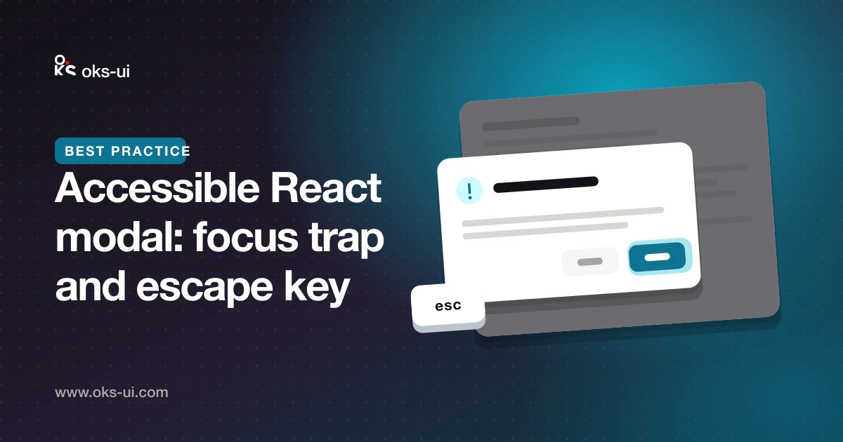
A modal dialog is a small box on screen, but for keyboard and screen-reader users it changes where the whole page lives. An accessible modal has five jobs. This guide explains each one and shows how oks-ui's Modal handles it, so you know what to check in any dialog you build or use.
import { Modal } from "oks-ui/modal";
import "oks-ui/modal.css";
import { Button } from "oks-ui/button";
import "oks-ui/button.css";
Job 1: tell assistive technology what it is
A dialog needs role="dialog", aria-modal="true" and an accessible name — usually its title. oks-ui's Modal sets all three from its props.
For confirmations that interrupt the user and need an answer, the correct role is alertdialog:
<Modal
  isOpen={open}
  onClose={() => setOpen(false)}
  role="alertdialog"
  title="Delete this project?"
  actions={
    <>
      <Button variant="bordered" onPress={() => setOpen(false)}>Cancel</Button>
      <Button color="danger" onPress={deleteProject}>Delete</Button>
    </>
  }
>
  The project and all its files will be removed. This can't be undone.
</Modal>
Job 2: move focus into the dialog
When the dialog opens, keyboard focus must move inside it. Otherwise the next Tab press walks through a page the user can no longer see.
Modal moves focus to the dialog panel by default. If one control is the natural starting point, such as the first field of a form, point initialFocusRef at it:
const nameRef = useRef<HTMLInputElement>(null);

<Modal isOpen={open} onClose={close} title="Rename file" initialFocusRef={nameRef}>
  <input ref={nameRef} defaultValue={file.name} />
</Modal>Job 3: trap focus inside
While the dialog is open, Tab and Shift+Tab must cycle through its own controls and never escape to the page behind. This is the focus trap.
The tricky case is focus sitting on something that isn't itself tabbable — like the dialog panel after job 2. A naive trap doesn't recognise it, so Shift+Tab lets the browser move focus out of the dialog. oks-ui treats that position as a wrap point: from the panel, Shift+Tab goes to the last control and Tab to the first. (This was a real bug in oks-ui before version 1.2, fixed along with a trap that didn't attach when a modal was opened after mounting.)
Job 4: close on Escape and restore focus
Escape should close the dialog. Modal does this by default; set closeOnEscape={false} only when closing by accident would lose work, and then give the user another obvious way out.
Closing is only half the job. Focus must go back to the element that opened the dialog, usually a button. Without this, focus falls to the top of the document and keyboard users lose their place. Modal remembers what was focused when it opened and returns focus there on close.
Job 5: stop the page behind from scrolling
Scrolling the page underneath an open dialog is disorienting, especially on phones. Modal locks page scrolling while it is open. The lock is counted, so a confirmation opened on top of a drawer keeps the page locked until both are closed.
Clicking outside
By default a click on the backdrop closes the dialog, which is what most people expect. For forms where a stray click would lose typed input, turn it off with closeOnOutsideClick={false}.
The 30-second keyboard test
Put the mouse away and try any dialog:
- Open it with the keyboard. Does focus land inside?
- Press Tab repeatedly. Does focus stay inside and wrap around?
- Press Shift+Tab from the very first position. Does it still stay inside?
- Press Escape. Does it close, and is focus back on the button that opened it?
If all four pass, the dialog works for keyboard users. With a screen reader running, also check that the title is announced when the dialog opens.
See every option on the Modal component page.