Buttons are the most used component in any interface, and small inconsistencies show up everywhere: three slightly different reds, icon buttons nobody can read with a screen reader, a save button pressed twice. This guide covers everything oks-ui's Button does, with advice on when to use what.
import { Button, ButtonGroup } from "oks-ui/button";
import "oks-ui/button.css";
Variants: how loud the button is
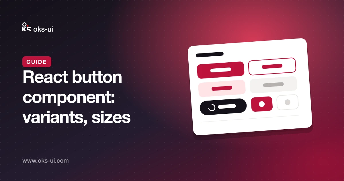
variant controls visual weight:
solid— filled. The main action on a screen, such as Save or Publish.soft— tinted background. Secondary actions that still need presence.bordered— an outline. A common choice for Cancel next to a solid primary.ghost— no background until hovered. Toolbars and dense rows.link— looks like a link. Inline actions such as "Forgot password?".
<Button variant="solid" color="primary">Publish</Button>
<Button variant="bordered">Cancel</Button>
<Button variant="link" color="primary">Forgot password?</Button>
A good rule: one solid button per area. If everything is loud, nothing is.
Colours: what the button means
color takes default, primary, secondary, info, success, warning or danger. Use colour for meaning, not decoration — danger for delete, primary for the main path. Since oks-ui 1.2, every colour's text meets the WCAG AA contrast ratio in light and dark mode.
<Button color="danger" onPress={remove}>Delete</Button>Sizes and shape
size takes xs, xs-sm, sm, md (default), lg and xl. Use lg for the main call to action on a landing page and sm inside tables and toolbars.
radius takes none, xs, xs-sm, sm, md, lg and full (pill). fullWidth stretches the button across its container — useful on phones and in narrow forms.
Handling clicks
Button calls onPress for mouse, touch and keyboard. A plain onClick works too.
<Button color="primary" onPress={() => save()}>Save</Button>Loading: stop double submits
Set isLoading while an action is running. The button shows a spinner, sets aria-busy for assistive technology, and ignores further clicks — so a slow save can't be sent twice.
<Button color="primary" isLoading={saving} onPress={save}>
  Save changes
</Button>
spinnerPlacement="end" moves the spinner after the label.
Disabled: use it sparingly
isDisabled greys the button out and blocks clicks. Disabled buttons give no reason why they are disabled, so prefer leaving the button enabled and explaining the problem when it is pressed — for example, form validation messages. When you do disable, add a nearby hint.
Icons
startContent and endContent place an icon before or after the label:
<Button startContent={<PlusIcon />} color="primary">New post</Button>
<Button endContent={<ArrowRightIcon />} variant="bordered">Next</Button>
Icon-only buttons need a label
For a button with only an icon, set isIconOnly and always give it an aria-label. Without one, a screen reader just says "button". oks-ui warns in development if the label is missing. A tooltip shows the same text on hover:
<Button isIconOnly variant="ghost" aria-label="Delete row" tooltip="Delete row">
  <TrashIcon />
</Button>
Buttons that are links
Navigation belongs in a link, even when it looks like a button. Pass href, or use as to render your router's link component:
<Button href="/pricing" color="primary">See pricing</Button>

import Link from "next/link";
<Button as={Link} href="/posts/new" color="primary">New post</Button>
A link to another site with target="_blank" automatically gets rel="noopener noreferrer".
Groups
ButtonGroup joins related buttons into one control and applies shared props like variant, size and color to all of them:
<ButtonGroup variant="bordered" size="sm">
  <Button>Day</Button>
  <Button>Week</Button>
  <Button>Month</Button>
</ButtonGroup>
When the group represents a single choice, a segmented control is usually clearer, because it shows which option is selected.
Try every prop live on the Button component page.