 oks-ui
Omkar Sahu · 8 min read
Published · Last reviewed · by Omkar Sahu

Chart had and how I reproduced each one on old versions.Three ideas do most of the work.
y = top + (1 - (value - low) / (high - low)) * height. SVG's y axis points down, hence the 1 -.M x y L x y L x y, and the browser draws it.Here they are together. This component compiles under TypeScript 7 in strict mode with noUncheckedIndexedAccess, and I rendered it in Chromium to check the output:
import { useId } from "react";

type Point = { label: string; value: number | null };

function niceTicks(min: number, max: number, count = 5): number[] {
  const raw = (max - min || 1) / (count - 1);
  const pow = 10 ** Math.floor(Math.log10(raw));
  const step = [1, 2, 5, 10].map((m) => m * pow).find((s) => s >= raw)!;
  const start = Math.floor(min / step) * step;
  const end = Math.ceil(max / step) * step;
  return Array.from({ length: Math.round((end - start) / step) + 1 }, (_, i) => start + i * step);
}

export function MiniLine({ data, title, width = 640, height = 240 }: { data: Point[]; title: string; width?: number; height?: number }) {
  const id = useId();
  const pad = { left: 44, right: 12, top: 12, bottom: 28 };
  const values = data.flatMap((d) => (d.value === null ? [] : [d.value]));
  const ticks = niceTicks(Math.min(...values), Math.max(...values));
  const lo = ticks[0]!;
  const hi = ticks[ticks.length - 1]!;
  const x = (i: number) => pad.left + (i * (width - pad.left - pad.right)) / Math.max(1, data.length - 1);
  const y = (v: number) => pad.top + (1 - (v - lo) / (hi - lo)) * (height - pad.top - pad.bottom);

  // One path per run of real values, so a missing value is a gap and not a zero.
  const runs: string[] = [];
  let run: string[] = [];
  data.forEach((d, i) => {
    if (d.value === null) {
      if (run.length) runs.push("M" + run.join("L"));
      run = [];
    } else run.push(`${x(i).toFixed(1)} ${y(d.value).toFixed(1)}`);
  });
  if (run.length) runs.push("M" + run.join("L"));

  return (
    <figure style={{ margin: 0, position: "relative" }}>
      <svg viewBox={`0 0 ${width} ${height}`} role="img" aria-labelledby={id} style={{ width: "100%", height: "auto" }}>
        <title id={id}>{title}</title>
        {ticks.map((t) => (
          <g key={t}>
            <line x1={pad.left} x2={width - pad.right} y1={y(t)} y2={y(t)} stroke="currentColor" strokeOpacity={0.15} />
            <text x={pad.left - 8} y={y(t)} textAnchor="end" dominantBaseline="middle" fontSize={11} fill="currentColor">{t}</text>
          </g>
        ))}
        {data.map((d, i) => (
          <text key={d.label} x={x(i)} y={height - 8} textAnchor="middle" fontSize={11} fill="currentColor">{d.label}</text>
        ))}
        {runs.map((d) => (
          <path key={d} d={d} fill="none" stroke="var(--oks-color-primary-600, #2563eb)" strokeWidth={2} />
        ))}
      </svg>
      <table style={{ position: "absolute", width: 1, height: 1, overflow: "hidden", clip: "rect(0 0 0 0)" }}>
        <caption>{title}</caption>
        <tbody>
          {data.map((d) => (
            <tr key={d.label}><th scope="row">{d.label}</th><td>{d.value ?? "no value"}</td></tr>
          ))}
        </tbody>
      </table>
    </figure>
  );
}
Rendered next to the Chart component with the same data, including a missing value in March:
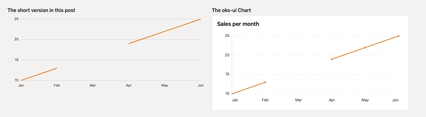
Two details in those 60 lines are there because a first version got them wrong. The line is built as one path per run of real values, so a missing value is a gap and not a zero. And the chart is an svg with role="img" and a title, followed by a visually hidden table, because a picture of numbers tells a screen reader nothing.
The short version draws one line. Everything below is what stands between it and something you can ship. I took eight cases from the Chart component's own gap register, drew the same data with oks-ui 1.1.2, 1.2.2 and 1.4.1, and measured the result:
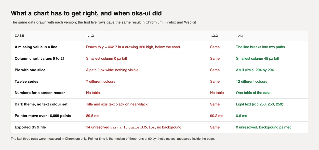
In 1.1.2 a null in a line was drawn as 0. In my test the path went to y = 462.7 in a drawing 320 units high, so the line left the chart through the bottom. In 1.4.1 each run of real values is its own path. The changelog adds that the tooltip used to say 0 and now shows a dash, and that the axis now scales to the values that exist; I did not test those two.
With values from 5 to 21, the old axis began at 5, so the smallest bar had no height at all: 0 px in all three browsers, against 45 px in 1.4.1. A bar's length is the quantity it shows, so a bar or column axis now always includes 0. Lines still follow their data. If you do want a truncated bar axis, there is an opt-out, axis.y.clampMinZero: false.
An SVG arc whose start and end points are the same point draws nothing, and a 100 percent slice starts and ends in the same place. The old path was M 343 160 L 343 13 A 147 147 0 1 1 343 13 Z, which measured 0 px wide. The fix is to draw it as two half circles, which measured 294 by 294 px.
A fixed palette of seven colours means series eight is the same orange as series one. With twelve series I counted 7 different line colours in the old versions and 12 in 1.4.1, which, the changelog says, reuses the same hues in lighter and then darker shades.
An svg with role="img" is a single picture to assistive technology, and ARIA does not allow focusable or interactive content inside it to be exposed. The old version had no text alternative for the numbers, and axe flagged an ARIA attribute the role does not allow. 1.4.1 adds a table of the data that only screen readers see (on by default up to 400 cells), and the points are reachable with the arrow keys. My accessibility audit found no axe violations on any chart page.
With no text colour set on the page, the old chart's title and axis labels were black (rgb(0, 0, 0)) on a near-black background. The changelog traces it to a text colour that pointed at a token that does not exist. It now falls back to the theme's neutral text colour, which measured rgb(250, 250, 250) on the same surface.
A chart is styled with CSS variables, and a saved SVG file cannot resolve them. The 1.1.2 export held 14 var() references and 15 currentColor and no background; opened on its own it looked like this:
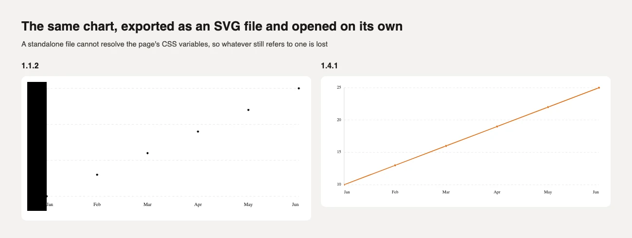
1.4.1 replaces every colour with its computed value, copies the font, and paints the chart's own background behind it.
I drew 16,000 points. Two things matter. First, moving the pointer: the changelog says the old version rebuilt the paths and the labels on every move, and in my test a move cost 89.5 ms, so the tooltip trailed the mouse. In 1.4.1 they are drawn once per change of data or size, and a move cost 0.6 ms (timed inside the page, with synthetic events). Second, the size of the drawing: all 16,000 points are a 622 KB path attribute and 272 DOM nodes. With decimate={{ enabled: true }} the chart keeps each bucket's first, last, lowest and highest point, so peaks survive, and the same data was 644 points, a 25 KB path and 33 nodes. Decimation is off by default, so turn it on if you chart more points than your plot has pixels.
I bundled a page that imports only Chart, left React external, then minified and gzipped it:
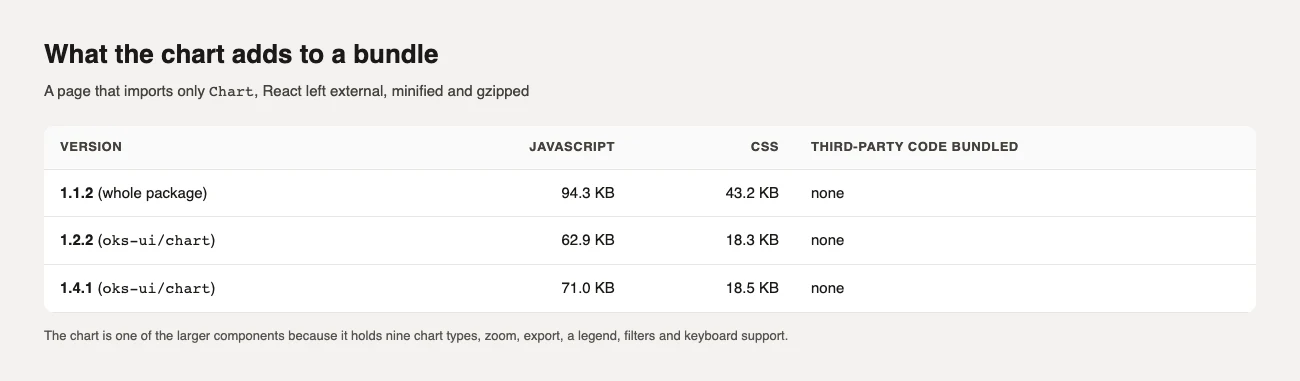
Nothing from outside oks-ui is bundled in any version. Chart is one of the larger components in the library, because it holds nine chart types, zoom, export, a legend, filters and keyboard support. If all you need is one line like the example above, the 60 lines cost far less.
The Chart component pages show every type with its props, and the Sparkline page shows the small version for table cells and stat cards.
I'm a front-end engineer based in Hyderabad, India, with more than 17 years of professional experience. I spent 12 years as a senior front-end developer, designing and building websites, and I have worked as a full-stack developer since 2022. I created oks-ui, a React component library with no runtime dependencies, and I write and maintain this site.