 oks-ui
Omkar Sahu · 8 min read
Published · Last reviewed · by Omkar Sahu

This is an audit of a library I maintain, so I have tried to write it the way I would want to read someone else's: what was measured, how, what it cannot tell you, and what is still wrong.
What this does not cover: I did not test with a screen reader such as VoiceOver or NVDA, so I cannot say how any of this sounds. Automated tools only judge what they can measure, so a clean axe run is not a claim that a page is accessible. I did not test zoom or text-size changes, high-contrast mode or voice control.
58 of 59 component pages had no axe violations in any of the three browsers, in light or dark. The exception is the Text editor page, where text on tinted backgrounds is too faint:
WCAG AA asks for 4.5:1 for normal-size text. Every pair above is below it; the dark "Edit" label misses by only 0.02.
One practical note: axe can report a different answer on the same page depending on when it runs. Straight after the page load event it reported no violations on this page; after a one second pause it reported the same 4 elements in light and 8 in dark every time. If you script axe, wait for the page to settle first. The script at the end of this post does.
Names. Every one of the roughly 6,800 Tab stops in each browser had an accessible name.
Focus indicators. Counting every distinct kind of focusable element across the pages (a button, a text field, a tab, a nav link and so on), there were 72 kinds. I took a screenshot of each one unfocused and focused with the keyboard, in light and dark, and compared the pixels. 70 of the 72 changed visibly when focused. A first version of this check read CSS properties instead of pixels and produced dozens of false alarms, because some components draw their focus ring on a different property than the one I was reading, so I discarded it. Of the other two kinds, one is a link inside the text editor demo that my script could not focus, so it is untested, and the other is the OTP field below.
The OTP field. This is the one real keyboard problem, on the OTP field page:
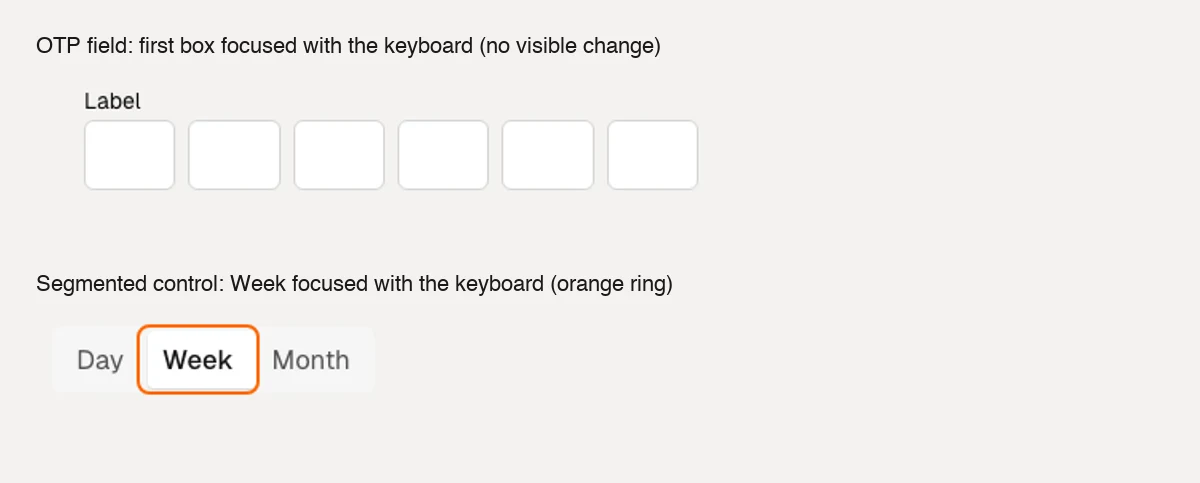
A keyboard user cannot skip an OTP field they do not want to fill in, and one who can get through it cannot see where they are. The first is at least a keyboard-flow failure, and arguably a failure of WCAG 2.1.2 (No Keyboard Trap), because Shift+Tab is the only way out.
For contrast, the segmented control is how it should look: Tab lands on the selected option, a clear orange ring appears, and the arrow keys move the selection.
Here is the version comparison. The count is the number of elements axe flags across the 48 examples.
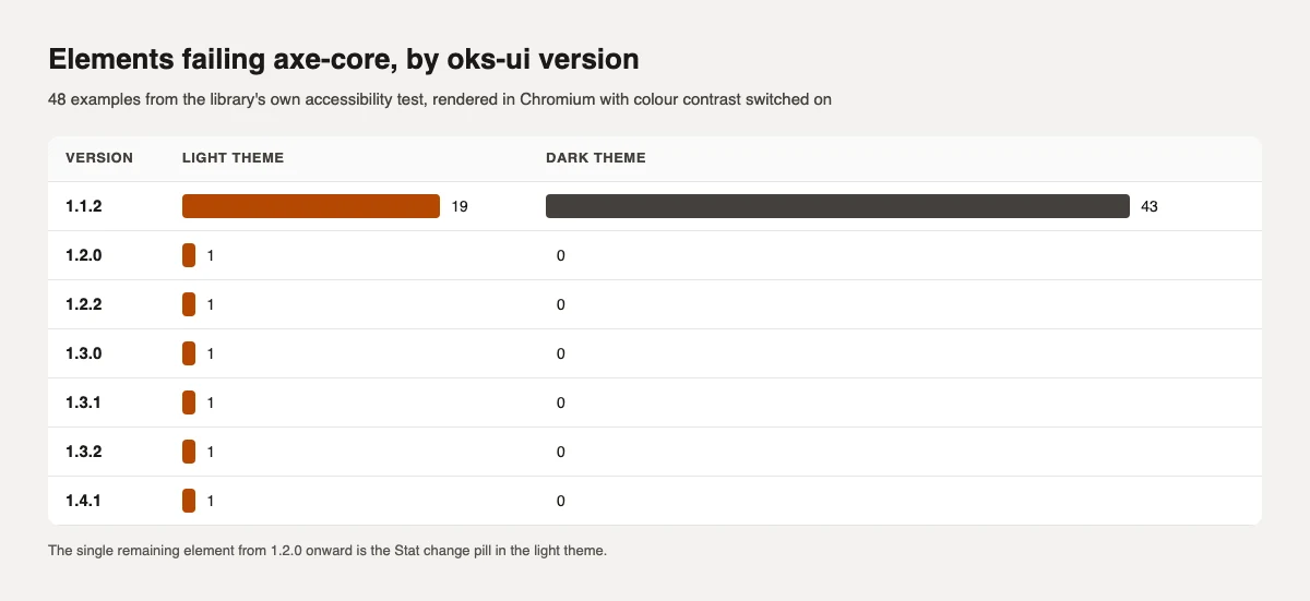
Nearly everything was fixed in one release, 1.2.0. Between 1.1.2 and 1.2.0 the 62 failing elements went to one. Here is every example that failed in 1.1.2:
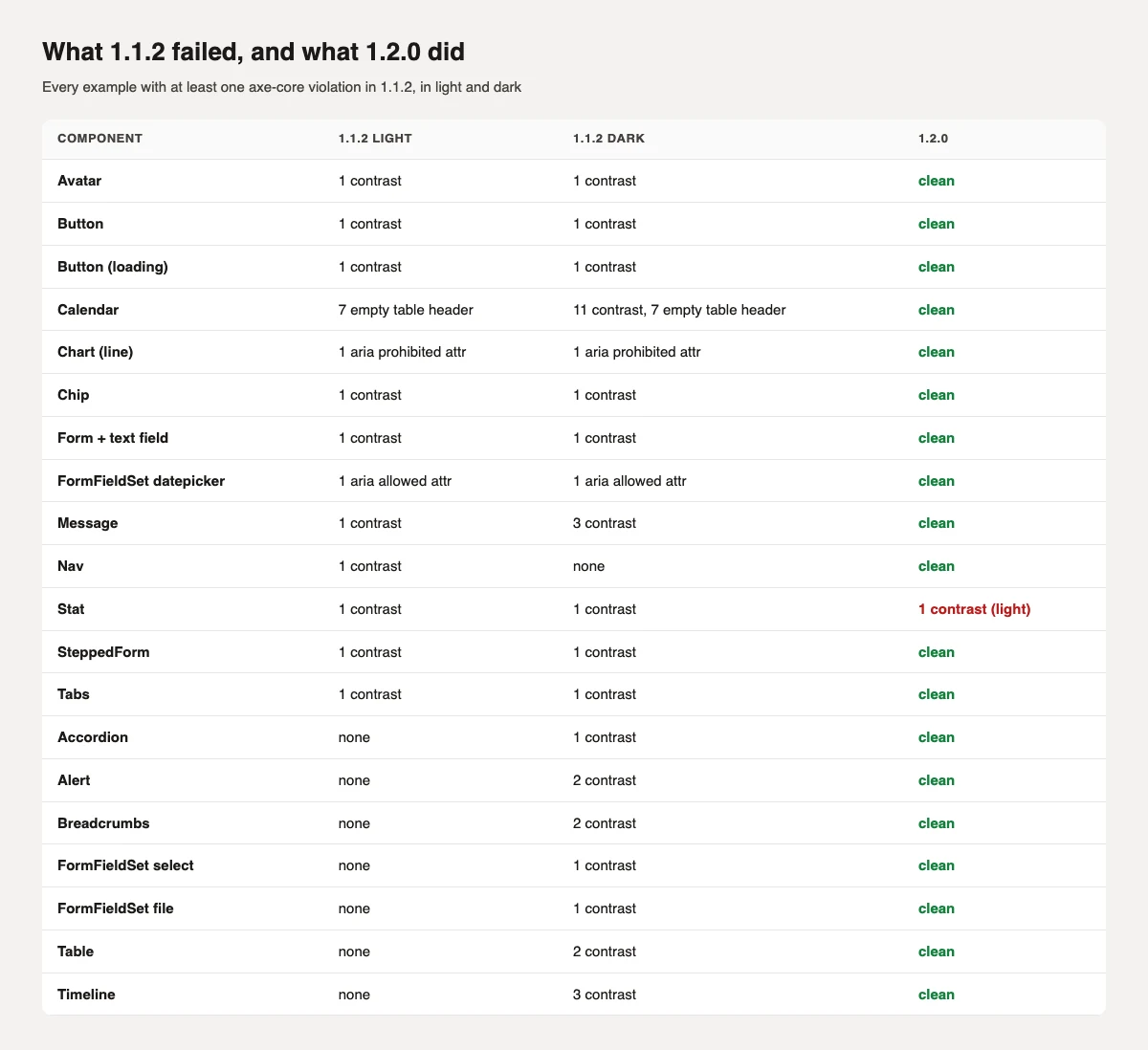
Most were text contrast, mostly in dark mode, but not all: the Calendar had seven empty table header cells, the line Chart carried an ARIA attribute its role does not allow, and the date picker field used an ARIA attribute that is not valid on its element. Focus handling in Modal and Drawer, which axe cannot see, was also fixed in 1.2.0; I reproduced that before and after in the 1.2 release notes.
The one element still failing from 1.2.0 to 1.4.1 is the small change pill in the Stat component, in the light theme (3.34:1 when I measured it on the dashboard tutorial).
1.3.2 changed the secondary text colour and the selected Nav label. A white page does not reveal why, because the old secondary text colour passed on white (4.7:1). It failed on a lightly tinted surface, which is what many app backgrounds are:
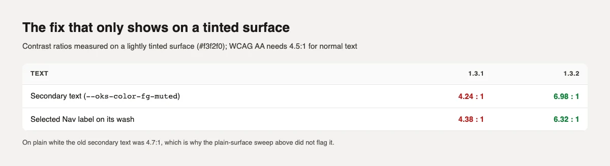
The lesson for anyone auditing their own pages: test your real backgrounds, not just white.
1.3.0 made Breadcrumbs, Pagination, SteppedForm and TextEditor turn their CSS transitions off when a reader has asked for reduced motion. I rendered them in 1.2.2 and 1.3.0 with prefers-reduced-motion: reduce emulated and measured the longest transition on each:
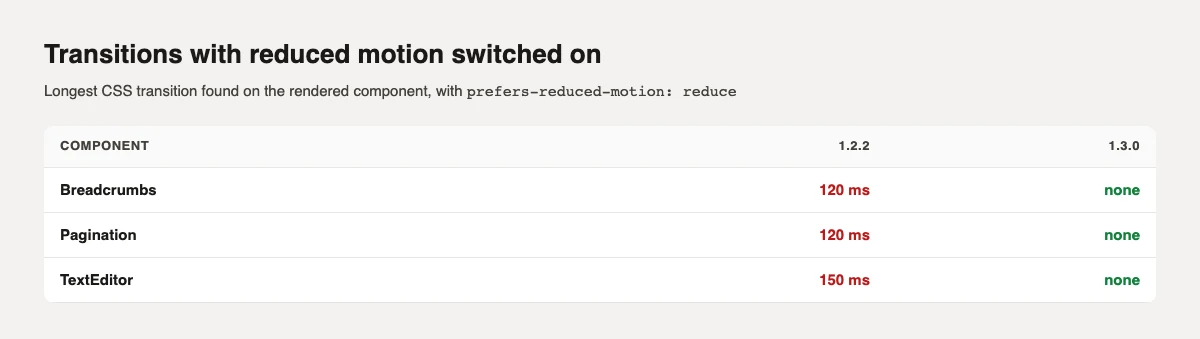
SteppedForm showed no transition in either version on its first step, so I could not confirm that one from the first step alone.
Confirmed by this audit:
Found earlier, while building and testing the tutorials on this site against oks-ui 1.4.1:
aria-describedby.None of these is fixed yet. I have not set a release date, and I will not pretend that listing them is the same as fixing them. When one is fixed it will appear in the changelog, and this page will be updated.
This is the script I used for the page sweep, trimmed to one file. Install playwright and axe-core, run npx playwright install chromium, and pass it your URLs:
import { chromium } from "playwright";
import { createRequire } from "node:module";

const axePath = createRequire(import.meta.url).resolve("axe-core/axe.min.js");
const urls = process.argv.slice(2);

const browser = await chromium.launch();
for (const scheme of ["light", "dark"]) {
  const page = await (await browser.newContext({ colorScheme: scheme })).newPage();
  for (const url of urls) {
    await page.goto(url, { waitUntil: "load" });
    await page.waitForTimeout(1000); // let fonts and client rendering settle
    await page.addScriptTag({ path: axePath });
    const violations = await page.evaluate(async () =>
      (await window.axe.run(document, { runOnly: ["wcag2a", "wcag2aa", "wcag21aa"] })).violations.map((v) => ({
        rule: v.id,
        elements: v.nodes.length,
        first: v.nodes[0].target.join(" "),
      })),
    );
    console.log(scheme, url, violations.length ? violations : "no violations");
  }
}
await browser.close();
Run it as node audit.mjs http://localhost:3000/ http://localhost:3000/settings. Note that colorScheme only switches pages that follow the system theme. If your app uses a data-theme attribute, set it on the html element before the check, as I did for the version comparison.
For the keyboard, no tool replaces doing it: unplug the mouse, press Tab from the top of each page, and watch for three things. Can you reach everything? Can you always see where you are? Can you always leave?
The accessible modal post covers how to build one of those parts correctly in your own app.
I'm a front-end engineer based in Hyderabad, India, with more than 17 years of professional experience. I spent 12 years as a senior front-end developer, designing and building websites, and I have worked as a full-stack developer since 2022. I created oks-ui, a React component library with no runtime dependencies, and I write and maintain this site.