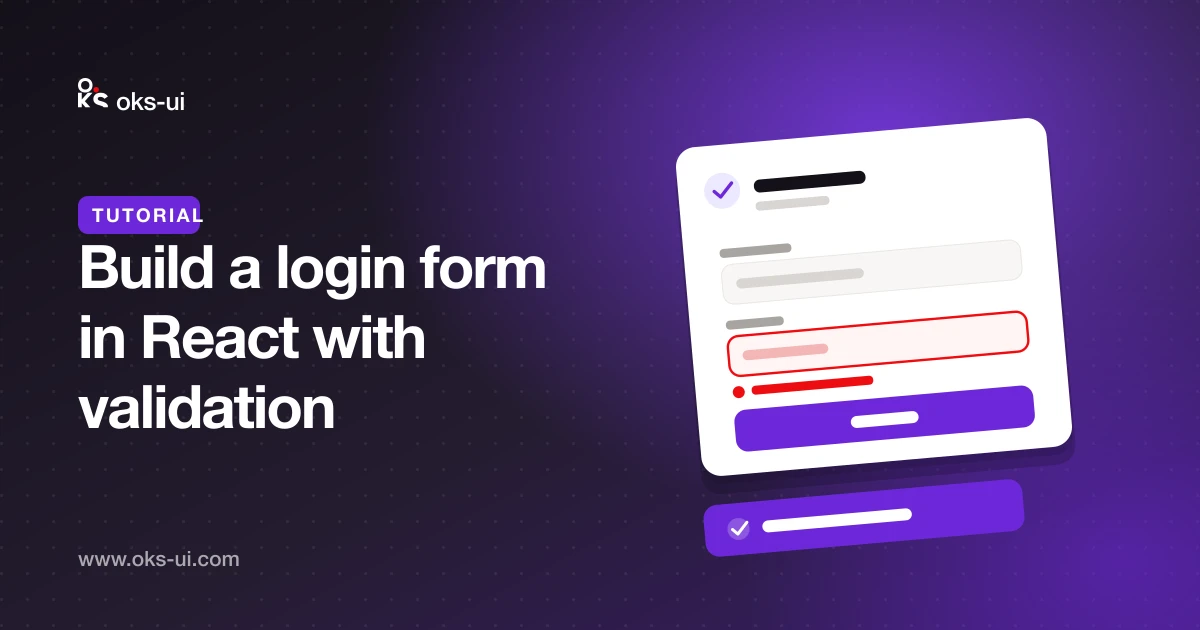
Almost every app starts with a login form, and most login forms get the same details wrong: errors that appear too early, password managers that can't fill the fields, and a submit button you can press twice. In this tutorial we build one that gets them right, using oks-ui's Form, FormFieldSet and Button.
What we're building
- An email field that must be filled in and look like an email address.
- A password field with a minimum length and a show/hide toggle.
- Error messages that appear after the user leaves a field, not while they're still typing.
- A submit button that shows a spinner and can't be pressed twice.
- Autofill that works, so password managers can do their job.
1. Install and import
npm install oks-uiImport each component from its own entry point, together with its stylesheet:
import { Form, FormFieldSet } from "oks-ui/form-field-set";
import "oks-ui/form-field-set.css";
import { Button } from "oks-ui/button";
import "oks-ui/button.css";2. The form
Form holds the values, runs validation and calls onSubmit only when every field is valid. Each FormFieldSet registers itself with the nearest Form by its name.
export function LoginForm() {
  async function handleLogin(data: Record<string, unknown>) {
    await signIn(String(data.email), String(data.password));
  }

  return (
    <Form onSubmit={handleLogin} disableAutofill={false} autoComplete="on">
      <FormFieldSet
        type="email"
        name="email"
        label="Email"
        placeholder="you@company.com"
        autoComplete="email"
        validation={{ rules: { required: true, email: true } }}
      />
      <FormFieldSet
        type="password"
        name="password"
        label="Password"
        autoComplete="current-password"
        validation={{
          rules: { required: true, minLength: 8 },
          message: { minLength: "Use at least 8 characters" },
        }}
      />
      <Button type="submit" color="primary" fullWidth>
        Sign in
      </Button>
    </Form>
  );
}
That's a working, validated login form. The next steps make it pleasant to use.
3. Let password managers fill it in
By default, oks-ui's Form disables browser autofill. That is the right default for most forms — nobody wants a saved address appearing in a "company name" field. A login form is the exception.
Two props turn it back on: disableAutofill={false} and autoComplete="on" on the Form. Then give each field the standard autocomplete token: email for the email and current-password for the password. A sign-up form would use new-password instead, which tells password managers to suggest a strong new password.
4. Show errors at the right moment
Errors that appear while someone is still typing their email feel like being told off. Form validates on blur by default: a field's error appears once the user leaves it, and after that it updates as they fix it.
Every rule has a default message. Override any of them with message, as the password field does above.
5. A button that can't be pressed twice
Form awaits your onSubmit. While the promise is pending, show a loading state so the user knows something is happening and can't send the form again. With the button's isLoading prop:
const [pending, setPending] = useState(false);

async function handleLogin(data: Record<string, unknown>) {
  setPending(true);
  try {
    await signIn(String(data.email), String(data.password));
  } finally {
    setPending(false);
  }
}

// …
<Button type="submit" color="primary" fullWidth isLoading={pending}>
  Sign in
</Button>
6. Show a failed login
Wrong password is not a validation error — the server decides it. Show it above the form with an Alert:
import { Alert } from "oks-ui/alert";
import "oks-ui/alert.css";

{error && (
  <Alert color="danger" variant="soft" title="Couldn't sign you in" description={error} />
)}
Keep the message general, such as "Email or password is incorrect". Saying which of the two was wrong tells an attacker which emails have accounts.
Accessibility you get for free
Each FormFieldSet connects its label to its input, marks invalid fields with aria-invalid, and links the error message to the field, so screen readers announce it. The password toggle is a real button with an accessible name.
Next steps
- Add "Forgot password?" as a
Buttonwithvariant="link"under the password field. - For sign-up, add a confirm-password field with the
matchFieldrule. - See every field type on the form components page.